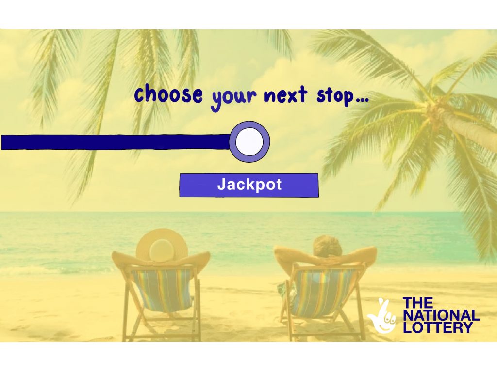
I wanted to target working adults who look forward to their holidays. To do this, I thought it would be a great idea to relate the ad to their daily commute. Instead of their next stop being work, the destination would be whatever they could spend their potential winnings on—perhaps a holiday or something else they’re saving for. I was also inspired by the actual TFL map, where I added the word ‘jackpot’ beneath the stop, similar to how the map displays different train lines branching off from a single station. I thought this was a nice touch, especially since many of the people seeing the ad in London would likely be commuters using public transport. It’s a way of making the ad feel more familiar and relevant to their daily routine.

This is my final Adobe mock-up for my National Lottery advert. While I kept the same body copy, I completely revamped the layout and overall design of the ad, drawing inspiration from the official National Lottery website. I thought it would be beneficial to align with the brand’s established identity, as this would enhance the credibility and persuasiveness of my work. To better target the specific audience I had in mind, I incorporated an image of a frustrated office worker next to someone enjoying a holiday. This contrast visually communicates the potential benefits of playing the National Lottery, offering a relatable reflection of the office worker’s life. The intention was to make the ad feel more personal and relevant to viewers who may share similar frustrations with the office worker depicted in the advert.